CSS Layout, part 1. Basics
Introduction
First, go through all steps of learnlayout.com. This is a clear resource on how CSS layout works, starting with the basics. Hopefully it's not too dry!
Then, watch this video, Don't Fear Layout. This might be repetitive, but when it comes to CSS Layout (which is generally not super intuitive), it's useful to go over this multiple times and in different ways. Also note this video is a little old.
Below are some key parts of both in my own words, just for reference...
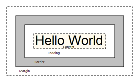
Box Model
Essentially, every element in HTML is a box.
And in general, every element responds to the "box model"... that is, it has padding, border, and margin around it. Each has different properties.

Inline vs. Block
By default, every HTML element is either display: inline or display: block.
Inline
Inline things "go in a line." They go with the flow.
<span> is the most generic inline element. Others include img, a, strong.
Inline elements are small and polite, only taking up as much space as their content, so they don't accept height or width parameters, and they also don't respond to padding or margin.
Block
Block things "stack on top of each other." Like blocks.
<div> is the most generic block element. Others include h1, p, li.
By default, block elements take up 100% horizontal space, but they also accept height and width parameters, along with all the box model parameters including padding and margin.
???
If you're not sure if the HTML element you're dealing with is inline or block, you can look it up. I like using htmlreference.io.
If you want to change the display property of your element, you can. Just use CSS and say display: inline; or display: block;.
Inline-block
You can also say display: inline-block; and get essentially the best of both worlds!
Things that are inline-block are both blocks (that accept height, width, padding, margin), but they also go with the flow, side-by-side, like inline elements. Try it out!
Position
The position property can help you manipulate the location of an element.
position: static; — default
position: relative;
position: absolute;
position: fixed;
When you use either position: absolute or position: fixed, know that you’re removing that element from the normal “flow” of the web page. When you use either of them, you’ll need to then include specific declarations that specify where your element should be. For example:
position: fixed;
top: 20px;
right: 20px;
This element is 20px away from the top edge of the page and 20px away from the right edge. It's in the upper right hand corner. And it's position: fixed, so when you scroll the page, it stays "fixed" there.
If I changed it to position: absolute, and I scrolled the page, it wouldn't stay "fixed" but scroll normally with the page.
Floats
The idea of “floats” comes from print layouts, where text wraps around an image on either left or right.
In CSS, the property float specifies that an element should be placed along the left or right side of its container, allowing text and inline elements to wrap around it. The element is removed from the normal flow of the web page, though still allowing other elements to wrap around it.
float: left;
float: right;
It's a little bit weird and peculiar, but you'll also learn that you'll need to "clear your floats" when they're done.
clear: both;
Units
In CSS, there are many different units you can use.
Some are absolute (unchanging), and others are fluid (changing, dynamic). The fluid units are often good to use when considering making websites work for multiple devices, including mobile.
- Pixels
pxare the most straightforward and inflexible - Percentages
%are flexible and dependent on their parent container - Ems
emare dependent on whatever font-size the parent container is. This is a relative unit. So2emequals 2 * whatever the font-size of the parent is. - Rems
remare dependent on whatever the font-size of the body are. So this unit is more global than em, since if I want to change the overall scale, I simply change the body font-size! vhandvwstand for viewport height and viewport width, which are relative not to the parent container (like percentages) but the browser window (the viewport), so100vhmeans "100 percent of the viewport height"
Flexbox, CSS Grid
Some newer CSS layout properties are useful, depending on your circumstance.
(Note that these properties don't work on some older browsers. Check out the website caniuse.com to explore which specifically.)
Flexbox
Flexbox "aims at providing a more efficient way to lay out, align and distribute space among items in a container, even when their size is unknown and/or dynamic." It's somewhat newer, since 2013.
CSS Grid
CSS Grid is "a CSS layout method designed for the two-dimensional layout of items on a webpage or application." It allows for "complex responsive web design layouts more easily and consistently across browsers." Like Flexbox, it's still a newer technology, so some older browsers don't support it. It's also newer, since 2017.
Responsive
We'll go over more responsive web design, including making your site usable on mobile, in a future tutorial. But it's good to start playing with the responsive and fluid possibilities in layout as a start!
Next...
Now onto the "Exercise" which is part 2 of this CSS tutorial...